Are you looking for unique and effective CSS styles to enhance your website? In this post, I’ll share 5 types of styles for websites that you can apply anywhere to improve design, functionality, and user experience.
Many people might wonder what this post is about, so let me explain in detail. This collection includes different CSS tricks, effects, and styles that can help you create modern, responsive, and visually appealing web pages. Whether you’re a beginner or an experienced developer, these styles will make your website stand out.
Stay tuned as I break down all 50 types of styles for websites that you can use effortlessly!
What Are Tooltips in UI?
Tooltips in UI are essential elements that provide users with additional information in a concise and interactive way. They typically appear as small pop-up boxes when a user hovers over or focuses on an icon, button, or text. The primary goal of tooltips in UI is to improve user experience by offering quick explanations without cluttering the interface.
Features of Tooltips in UI
- Brief Information – Tooltips provide short and clear explanations.
- Automatic Display – They appear when the user hovers or focuses on an element.
- Temporary Visibility – Tooltips disappear when the user moves the mouse away or loses focus.
- Versatility – They can include text, images, links, or other elements.
Common Uses of Tooltips in UI
- Form Field Instructions – Provide guidance on what information is required.
- Icon Explanations – Describe the purpose or functionality of icons.
- Quick Information – Offer extra details about an item without taking up space.
- Accessibility Improvement – Assist screen readers by providing additional context.
By using tooltips in UI, designers can enhance usability and create a more user-friendly experience. Implementing them correctly ensures users receive helpful information without overwhelming the interface.
Examples of Tooltips in UI
Tooltips provide quick explanations when users hover over an element. Here are some examples:
- “Click this button to upload a file.” – A tooltip appearing over an upload button.
- “This icon opens the Preferences menu.” – A tooltip explaining an icon’s functionality.
Creating Tooltips in UI
Different programming languages and frameworks offer various methods for creating tooltips:
HTML & CSS – Simple tooltips can be added using the title attribute:
<button title="Click to upload a file">Upload</button>JavaScript & jQuery – More advanced tooltips with custom styling and behavior:
$(document).ready(function(){
  $('[data-toggle="tooltip"]').tooltip();
});
CSS Frameworks – Pre-built tooltip components are available in frameworks like:
- Bootstrap (
data-bs-toggle="tooltip") - Materialize (
tooltippedclass)
Using these methods, developers can efficiently create tooltips that improve usability, accessibility, and user experience
Example (Bootstrap Tooltip)
Bootstrap provides a simple way to add tooltips using HTML attributes. Here’s an example:
<button type="button" class="btn btn-secondary" data-toggle="tooltip" title="Click this button to upload a file">
  Upload
</button>
Note: Bootstrap’s JavaScript and CSS files must be included for this to work.
50 Tooltip Styles – A Multi-Part Series
Since 50 tooltip styles would make a single post too long, I’ll be sharing them in 5 parts. Each part will contain 10 unique tooltip styles with their CSS.
HTML Structure for All Styles
The following HTML snippet will be used for each tooltip style:
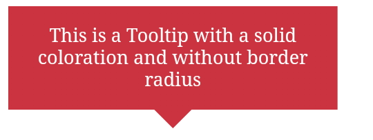
<div class="tooltip">This is a Tooltip with a gradient coloration and without border-radius</div>
Arrow Position Customization
To adjust the position of the tooltip’s arrow, modify the following CSS variable:
--p: 50%; /* Triangle position (0%: left, 100%: right) */
How it works:
- 50%: The arrow appears in the center.
- Increase/Decrease the value to shift the arrow left or right.
Gradient Tooltip with Custom Arrow
- This is the first tooltip style in our 50 CSS tooltip styles series. It features:
- Custom arrow positioning
- Smooth gradient color
- Text styling for readability
HTML Structure
<div class="tooltip">This is a Tooltip with a gradient coloration and without border-radius</div>
CSS Code
.tooltip {
  color: #fff;
  font-size: 18px;
  max-width: 28ch;
  text-align: center;
}

/* Tooltip Arrow and Design */
.tooltip {
  /* Triangle dimension */
  --b: 2em; /* Base width of the arrow */
  --h: 1em; /* Arrow height */

  --p: 50%; /* Arrow position (0%: left, 100%: right) */

  padding: 1em;
  clip-path: polygon(
    0 100%, 0 0, 100% 0, 100% 100%,
    min(100%, var(--p) + var(--b)/2) 100%,
    var(--p) calc(100% + var(--h)),
    max(0%, var(--p) - var(--b)/2) 100%
  );

  /* Tooltip Background Color */
  border-image: fill 0 // var(--h) conic-gradient(#CC333F 0 0);
}
How This Works
Custom Arrow Positioning:
- The
--pvariable controls the arrow’s position. - 50% (default) keeps the arrow centered.
- Adjusting it towards 0% (left) or 100% (right) shifts the arrow.
Gradient Effect:
- The
conic-gradient(#CC333F 0 0)fills the tooltip background with a vibrant color.
Live Demo (Apply CSS to See the Effect!)
Example:
.tooltip {
  color: #fff;
  font-size: 18px;
  max-width: 28ch;
  text-align: center;
}
.tooltip {
  /* triangle dimension */
  --b: 2em; /* base */
  --h: 1em; /* height */

  --p: 50%; /* triangle position (0%:left 100%:right) */

  padding: 1em;
  clip-path: polygon(0 0,0 100%,100% 100%,100% 0,
    min(100%,var(--p) + var(--b)/2) 0,
    var(--p) calc(-1*var(--h)),
    max(0%  ,var(--p) - var(--b)/2) 0);
  border-image: fill 0//var(--h)
    conic-gradient(#79BD9A 0 0); /* the color */
}
.tooltip {
color: #fff;
font-size: 18px;
max-width: 28ch;
text-align: center;
}
.tooltip {
/* triangle dimension */
--b: 2em; /* base */
--h: 1em; /* height */
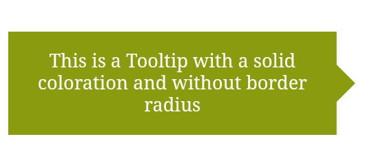
--p: 50%; /* triangle position (0%:top 100%:bottom) */
padding: 1em;
clip-path: polygon(100% 100%,0 100%,0 0,100% 0,
100% max(0% ,var(--p) - var(--b)/2),
calc(100% + var(--h)) var(--p),
100% min(100%,var(--p) + var(--b)/2));
border-image: fill 0//var(--h)
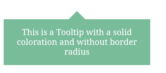
conic-gradient(#8A9B0F 0 0); /* the color */
}
.tooltip {
color: #fff;
font-size: 18px;
max-width: 28ch;
text-align: center;
}
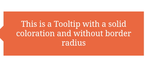
.tooltip {
/* triangle dimension */
--b: 2em; /* base */
--h: 1em; /* height */
--p: 50%; /* triangle position (0%:top 100%:bottom) */
padding: 1em;
clip-path: polygon(0 100%,100% 100%,100% 0,0 0,
0 max(0% ,var(--p) - var(--b)/2),
calc(-1*var(--h)) var(--p),
0 min(100%,var(--p) + var(--b)/2));
border-image: fill 0//var(--h)
conic-gradient(#EB6841 0 0); /* the color */
}
.tooltip {
color: #fff;
font-size: 18px;
max-width: 28ch;
text-align: center;
}
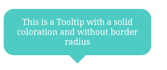
.tooltip {
/* triangle dimension */
--b: 2em; /* base */
--h: 1em; /* height */
--p: 50%; /* triangle position (0%:left 100%:right) */
--r: 1.2em; /* the radius */
--c: #4ECDC4;
padding: 1em;
border-radius: var(--r) var(--r) min(var(--r),100% - var(--p) - var(--b)/2) min(var(--r),var(--p) - var(--b)/2)/var(--r);
clip-path: polygon(0 100%,0 0,100% 0,100% 100%,
min(100%,var(--p) + var(--b)/2) 100%,
var(--p) calc(100% + var(--h)),
max(0% ,var(--p) - var(--b)/2) 100%);
background: var(--c);
border-image: conic-gradient(var(--c) 0 0) fill 0/
var(--r) calc(100% - var(--p) - var(--b)/2) 0 calc(var(--p) - var(--b)/2)/
0 0 var(--h) 0;
}
.tooltip {
  color: #fff;
  font-size: 18px;
  max-width: 28ch;
  text-align: center;
}
.tooltip {
  /* triangle dimension */
  --b: 2em; /* base */
  --h: 1em; /* height */

  --p: 50%; /* triangle position (0%:left 100%:right) */
  --r: 1.2em; /* the radius */
  --c: #6A4A3C;

  padding: 1em;
  border-radius: min(var(--r),var(--p) - var(--b)/2) min(var(--r),100% - var(--p) - var(--b)/2) var(--r) var(--r)/var(--r);
  clip-path: polygon(0 0,0 100%,100% 100%,100% 0,
    min(100%,var(--p) + var(--b)/2) 0,
    var(--p) calc(-1*var(--h)),
    max(0%  ,var(--p) - var(--b)/2) 0);
  background: var(--c);
  border-image: conic-gradient(var(--c) 0 0) fill 0/
    0 calc(100% - var(--p) - var(--b)/2) var(--r) calc(var(--p) - var(--b)/2)/
    var(--h) 0 0 0;
}
Tooltips are a powerful UI/UX design element that enhances usability, improves accessibility, and provides quick information without cluttering the interface. Throughout this series, we have explored 50 unique tooltip styles, each offering different designs, effects, and customization options.
By using CSS, JavaScript, and frameworks like Bootstrap, you can implement tooltips that are interactive, visually appealing, and user-friendly. Whether you need simple text-based tooltips or complex animations with dynamic effects, this collection provides the flexibility to enhance your website’s design.
Key Takeaways from This Series:
Tooltips improve user experience by providing instant information.
Custom CSS allows for creative tooltip designs, including gradient effects, animations, and arrow positioning.
Frameworks like Bootstrap and Materialize offer ready-to-use tooltip components.
Accessibility is crucial—ensure tooltips are screen reader-friendly and usable on all devices.


Related Posts
Stay Informed With the Latest & Most Important News
Previous Post
Next Post